Higher Ed
Collaboration for Completion: Expanding Access With Course Sharing Infographic
Course availability is a barrier to on-time graduation. Learn how course sharing helps learners stay on track and simplifies processes for institutions.
We use cookies to help you navigate efficiently and perform certain functions. You will find detailed information about all cookies under each consent category below.
The cookies that are categorized as "Necessary" are stored on your browser as they are essential for enabling the basic functionalities of the site. ...
Necessary cookies are required to enable the basic features of this site, such as providing secure log-in or adjusting your consent preferences. These cookies do not store any personally identifiable data.
Functional cookies help perform certain functionalities like sharing the content of the website on social media platforms, collecting feedback, and other third-party features.
Analytical cookies are used to understand how visitors interact with the website. These cookies help provide information on metrics such as the number of visitors, bounce rate, traffic source, etc.
Performance cookies are used to understand and analyze the key performance indexes of the website which helps in delivering a better user experience for the visitors.
Advertisement cookies are used to provide visitors with customized advertisements based on the pages you visited previously and to analyze the effectiveness of the ad campaigns.
Other cookies are those that are being identified and have not been classified into any category as yet.

Last night we updated Parchment.com with a new, redesigned look and feel. The growth we are experiencing not only inside, but outside our core academic markets, created a need to adapt the website to accommodate all of the audiences we engage with. A website serves as a gateway to ordering and information, two critical pieces in providing a high-quality Parchment experience. As such, we kicked-off a phased overhaul initiative in 2016 that will continue into the future. Here is where we’ve been and where we’re going.
The 2016 launch was a great accomplishment for us. We combined multiple sites into one to help create a more cohesive experience. Instead of navigating across multiple domains to locate information, you were now able to more easily find everything you need, under one domain and website.
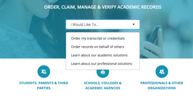
Through constant monitoring, we started to notice some patterns in user behavior that signaled an opportunity for us to improve. Two main themes surfaced. Providing our most frequent visitors an easy way to get to where they needed to be, no matter where they are on the website. And, to help those looking to order transcripts, diplomas or other credentials get to the right place to quickly start their order.
We designed the new site with a few principles, the guiding one being identifying who the visitor is (student, parent, verifier, counselor, registrar, etc.) and where they want to go.
That led us to add a few new features:

Global Navigation Bar

Other noticeable changes are to our blog, product and market page layouts, the addition of a resource section and longer scrolling pages with sticky navigation bars. We will continue to make changes and enhancements to the website as the years go along.
We love feedback! Please email info@parchment.com with any comments, questions or suggestions you might have.
